The Company
Kohepets is the largest online pet store in Singapore with more than 10,000 products. They have a loyal customer base with a high number of returning visitors but they struggled with converting them to the actual sales.
Kohepets’ Challenges
They have around 61% of their traffic on mobile devices and mobile visitors convert 61.7% less compared to desktop visitors.
It was obvious we need to deliver mobile-first approach to conversion optimization to see the best results.
Solution & Results
We started with Ecommerce Audit to analyze every single piece of their data (Google Analytics, Heatmaps, Scrollmaps, session recordings, etc.). It helped us understand customer shopping behavior and find out the main roadblocks in their conversion funnel.
Next step was qualitative research to reveal the insights from their customers. We used on-site poll and customer surveys to identify any shopping experience issues and to understand better the motivation, anxiety and urgency triggers.
Understanding why their customers purchase and what stops them from buying were essential for creating the conversion optimization strategy leading to a total conversion rate growth of 68.5% so far. And we’re not done!
Key Results
Pixelter has been doing a great job for Kohepets and we appreciate their help. Their conversion optimization strategy helps us with improving our online store and growing our sales.
Solution & Results Here’s how we did it
- Data and user behavior analytics
- Mobile UX research
- Qualitative research
- Implementing “Quick Fixes”
- Creating data-backed strategy
- Performed A/B tests
Challenge #1
High Homepage Bounce Rate
Our research showed that there are 3 main customer categories – dog, cat or small pet owners. A high percentage of customers don’t purchase on the first visit and return to the store multiple times.
It often takes up to 3 sessions to finish a purchase and a majority of repeated visitors arrive on the homepage as their landing page. They usually use the navigation to access relevant categories, not the homepage content.
Our Solution: Personalized Homepage
Based on these insights, we created a hypothesis that providing personalized homepage content for each customer category will help them find the right products much faster with less friction.
The data also showed people going directly to preferred subcategories such as “Dog Food” or “Cat Toys” are more likely to purchase.
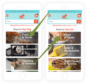
The original homepage was very simple with just a few elements – a top slider and eight smaller banners linking to the main pet categories. Only 3.1% of visitors engage with the homepage elements and they used the navigation instead.
Variation A

We created “Variation A”, which includes a personalized section with banners for direct access to the main categories. If a returning customer visited the dog products and dog categories, we show them only relevant content with the top dog banners.
The same goes for cat and small pet owners. This provides their customers quick access to the most important sections of the site based on their previous preferences.
“Variation A” was A/B tested against the original version for 21 days and delivered conversion increase of 14.1% with 97.3% probability of being the best compared to the original.
Challenge #2
Low Add To Cart Rates & High Exit Rates
Our research suggested that a product page is very often a landing page for new visitors. They suffered from high exit rates and bounce rates.
We need to improve the product page structure to address new visitor questions and concerns to remove any anxiety about their purchase. Many of the new visitors also don’t know the store brand, so we had to present a value proposition.
Qualitative research shows many hints why it’s happening – visitors are worried about product fit for their specific pet breed and life stage. They also very often buy at the last minute before their food supply runs out, so they are highly sensitive to the fast delivery.
Our Solution: Added Urgency, Social Proof & Delivery
We also noticed that it often takes them up to 3 same product page visits to buy a product, so we needed to create an urgency to shorten the purchase decision process.
Variation C

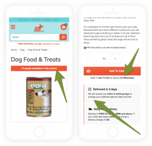
We created “Variation A” that includes value proposition such as their loyalty program or super fast delivery. The new product page also includes details about ideal fit for different pet segments and the exact amount of saving from their deals.
On top of that, we created “Variation B” that includes urgency trigger with “Order in next 1h 12m for tomorrow delivery” right next to the Add To Cart button to keep the proximity to the main call to action.
We also prepared “Variation C” that had additional social proof with a banner “X people just purchased this product” including live product sales data from a previous couple of days.
Altogether, the “Variation C” was a big success with 11.7% increase in sales and 19.3% increase in add to cart rate. It also dramatically reduced product page bounce rate, which helps them with search engine ranking.
It had 95.2% chance of being the best compared to the control variation after 28 days, so it was an easy choice to deploy the changes.
Challenge #3
High Category Exit Rates
The data showed low category to product conversions on mobile devices and a huge potential to drive visitors to the bottom of the conversion funnel.
We deployed on-site polls on category pages to discover what stops customers from visiting product pages. The collected insights showed us that they have a hard time choosing a product that will be a good option for them.
We discovered visitors often visit more than around 3 pages on each category to see more products and then return back to the first or second page.
Our Solution: Improved Layout, Social Proof, Infinite Scrolling
There wasn’t any product recommendation in a category or any social proof that would help customers to quickly find great products.
From user experience perspective, the top of the category page was cluttered with elements that work good on a desktop but are useless on mobile (banner, category description etc.).
The product listing was also one per row, and it took too much scrolling to go over the products.
Variation C

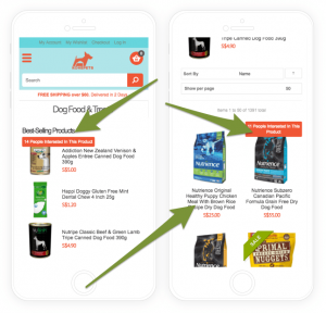
We created “Variation A” that includes product recommendations via three best-selling products for each category to provide product recommendations.
On top of that, we created “Variation B” including social proof for trending products. Top three trending products get a small badge with the live number of recent product visitors such as “X people interested in this product”.
The final “Variation C” also included a simplified mobile UI by removing the top elements (e.g. banner). We also changed the product grid from one item per row to two items per row to reduce the amount of scrolling and increased product images.
“Variation C” delivered great results with 27.8% increase in category-to-product conversions and 9.6% growth in mobile sales. It also delivered improvements to most of the engagement metrics such as pages per session or time on site.
“Variation C” combined all improvements and had 95.8% of being the best after 21 days of A/B testing.
Challenge #4
High Search Results Exit Rate
Site search data showed that a large number of their search is happening on category pages. It was important especially on mobile because customer very often uses search or abandon the site instead.
Visitors using the search feature on category pages are also 3x more likely to purchase compared to the other visitors.
We analyzed the search terms on different category pages and discovered that customers often search for products in the specific category. They used it instead of category filters.
Our Solution: Category Specific Search
Our hypothesis was that creating category specific search feature that is always visible on mobile would increase the number of visitors using the search feature, improve the search results, and increase search to product click-through rates.
Variation A

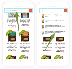
We created “Variation A” that includes a fixed search banner on mobile. Even if a visitor scrolls down, it’ll be just one click away. We also allowed customers to search only in the current category with a label such as “Search in dog food”.
The new category search delivered 41.3% increase in search on mobile devices, resulting in 21.1% increase in category-to-product conversions, and most importantly, increased mobile conversion by 10.2%.
The main KPI was the actual conversion rate, and it had 97.6% chance of being the best compared to the original control version.
Key Takeaways
These are just some of the tests we’ve done for Kohepets. We’ve had 72% success rate with our tests so far thanks to the extensive research we put into creating every new variation.
That’s the good thing about A/B testing – you find out what works and what doesn’t and get value from negative tests to build successful ones. We have a structured conversion approach that helps us continuously deliver improvements for any ecommerce site.
As you can see, we use Bayesian Statistics to evaluate results of each test to give our customers better understanding of the impact on their actual revenue. We aim for 95% probability of being the best and at least 150 conversions per variation to make sure the results are accurate.
Do you want to capture lost revenue?
Traffic to your store is great, but why do most of your visitors never purchase? We help you increase your conversion rate and average order value to unlock your hidden revenue potential.
Converting more visitors and increasing their spending is the way to beat your competitors. If you don’t do it, they will and it’s gonna be even more difficult for you.
But how can you do it?
Get a FREE Mobile UX Assessment of your online store. Our conversion expert will review your site and give you highlights of your main mobile issues that stop your visitors from converting.
We offer only 7 free assessments every month so make sure you catch yours quickly.

